Give Screenshots More Space
06/13/2021, SunScreenshot To Gutters
While taking an image screenshot of an entire software application such as the browser or terminal intact yields the most information when attempting to describe the behavior. It can be a bit difficult to discern what is actually happening in the application due to the "zoomed out" nature of the taken image. It is rare that a user will need to focus on the entirety of the image when a screenshot is shown, because only a certain portion of image is reference at one time.
This is especially true and more pronounced problem for images taken of the terminal where the font size is not that large to begin with, and the problem is due in part to people having larger monitors with high resolutions.
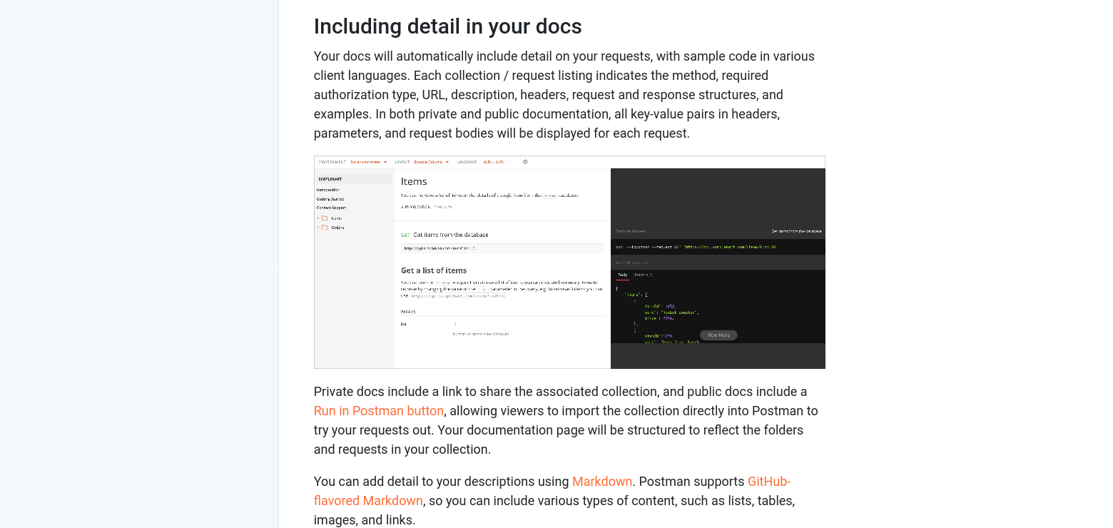
The example show here occurs with the Postman Api tool shows what could happen when you are viewing their documentation site when you are on a midsize screen of 1575px:
Here the above site shown on with a screen of 800px in width:
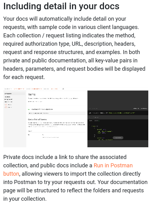
Even on the moderately size screen, the image is not ideal as text in the image is not legible. Also, on the second example, while most people aren't using their mobile phones to view the documentation while developing Apis, they might still do in a pinch to reference something useful.
A quick fix for this problem is to use the right gutter as excess space for the display of the screenshot. I found an example of this using CSS grid from this article.
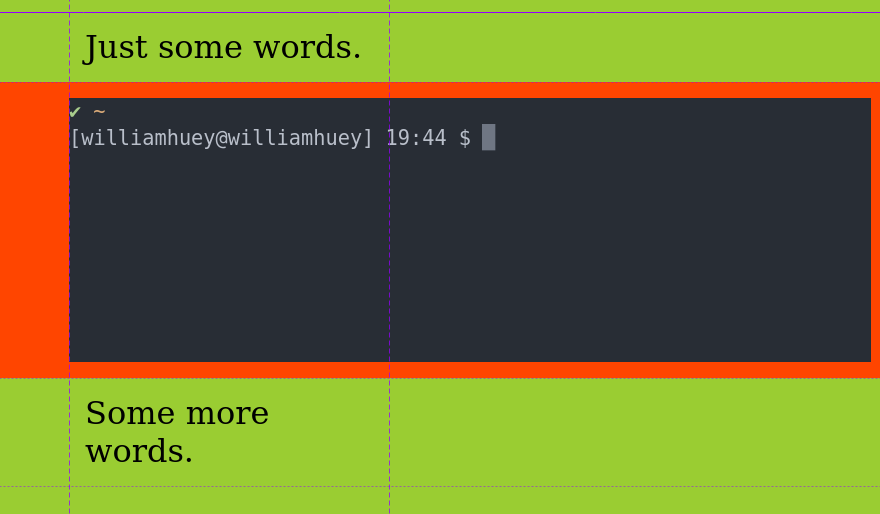
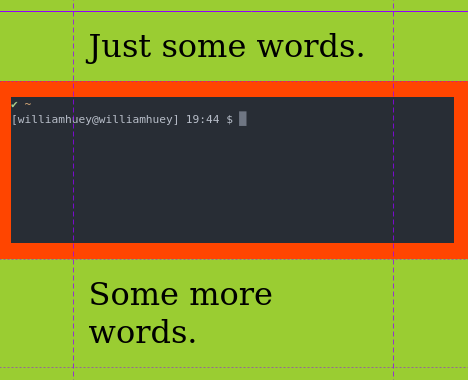
Borrowing ideas from the article link above, here is a pare-down example of how an image can take up more space on the right when the screen size allows for it:
<!DOCTYPE html>
<html lang="en" >
<head>
  <meta charset="UTF-8">
  <title>
    Image spans outside central column. Image flows to the right gutter.
  </title>
  <link rel="stylesheet" href="./style.css">
</head>
<body>
  <div class="content">
    <p>Just some words.</p>
    <figure>
        <img src="./even-more-amazing.svg" alt="smiley">
    </figure>
    <p>Some more words.</p>
  </div>
</body>
</html>
* {
margin: 0;
}
body {
background: yellowgreen;
color: #000;
margin: 2rem 0;
}
p {
font-size: 4rem;
padding: 2rem;
}
figure {
background: orangered;
}
img {
max-width: 100%;
}
.content {
display: grid;
grid-template-columns:
[full-start] minmax(1em, 1fr)
[main-start] minmax(0, 40em)
[main-end] minmax(1em, 1fr)
[full-end];
}
.content > * {
grid-column: main;
}
.content > figure {
grid-column: full;
padding: 2rem
}
.content > figure img {
display: block;
width: 100%;
}
@media (min-width: 60em) {
.content > figure {
align-items: end;
display: inherit;
grid-template-columns: inherit;
}
.content > figure > img {
grid-column: main / full;
}
}The general idea of the CSS is to divide the page to three vertical columns area and the image spans the middle (main) and the right of main when the screen size is mid to large (60em or greater) and then the image takes the whole width of the screen on sizes less than 60em:
While the CSS grid solution helps with viewing the screenshot on mid to large size screens, it only buys time until the small screen sizes are encountered.
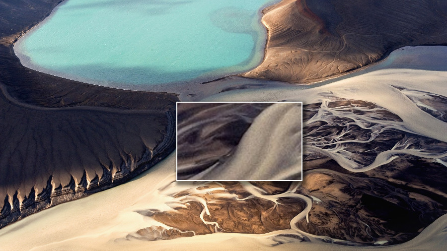
One solution to solving this problem is to increase the text size when taking a screenshot of the whole application or to crop the important part of the screenshot out and explain what the image is about. Another idea is to use a loupe to have a "call-out" kind of view of the important parts of the screenshot. This is commonly seen in e-commerce sites where you need to look at the details of an item on the product page.
Having responsive text is certainly not an issue with the modern web, but having responsive screenshots are also warranted because it serves to better the user experience when viewed when you are on a smaller device. This entails more careful consideration of how screenshots should be taken.